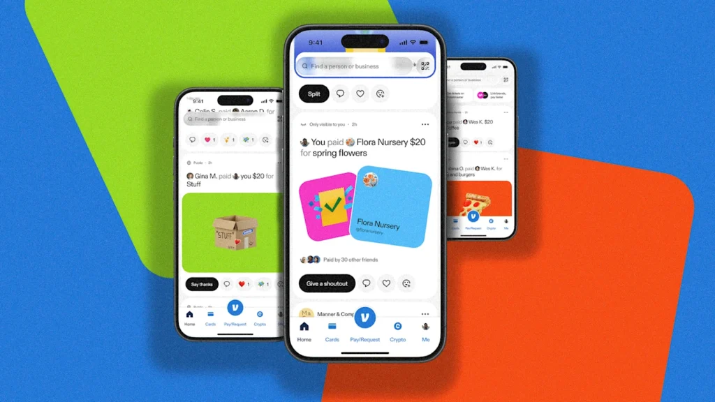
Venmo is rolling out its first complete app redesign since the payment app launched 15 years ago. The overhaul promises to fix the cluttered interface that’s been frustrating users for years.
The timing makes sense. Venmo has grown from a simple way to split dinner bills into a full financial platform with debit cards, retail partnerships, and rewards programs. But all those new features got crammed into an outdated design that made finding anything feel impossible.
Buried Treasure Problem
Venmo’s team spent a year interviewing users and discovered a big problem: people had no idea about most of the app’s features because they couldn’t find them. Want to send a gift card? You’d have to start a regular payment first to unlock that option. Looking for your transaction history? Good luck navigating that maze.
The app now handles serious money. Venmo processes payments for major companies like Uber, McDonald’s, and TikTok Shop, and boasts over 100 million accounts with payment volume up 14% year-over-year. But the interface still looked like it belonged in 2010.
The redesign focuses on making features actually discoverable. Instead of burying gift cards and other tools in random menu corners, everything gets organized in a way that makes sense to normal humans.
Venmo users should start seeing the updated design roll out in early 2025. The company hopes the cleaner interface will help people discover features they never knew existed.