Kit Kat has created new print ads that bend and break their famous logo to match how people actually eat the chocolate bar. The ads show the Kit Kat letters snapping, cracking, and splitting apart just like the candy itself.
This clever twist makes their “Have a break” slogan literally come to life on paper. Instead of just talking about breaking off pieces of chocolate, the logo actually breaks too.
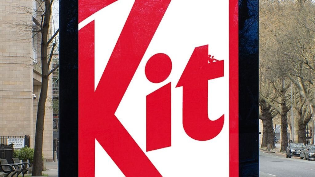
Logo Gets The Snap Treatment
The campaign takes Kit Kat’s most recognizable feature – the satisfying snap when you break off a piece – and applies it to their branding. Each poster shows the logo in a different stage of being broken apart, from tiny cracks to completely separated letters.
It’s a smart move that connects the physical experience of eating Kit Kat with seeing their ads. When you look at the broken logo, you can almost hear that distinctive snap sound the chocolate makes.
The ads work because they capture something every Kit Kat eater knows – that moment when you break off a piece and it makes that perfect clean snap. By making their logo do the same thing, Kit Kat creates an instant connection between their branding and the actual product experience.
What Comes Next
These print ads could signal a broader shift toward more interactive branding. Other food companies might start making their logos behave like their products – imagine Oreo letters that twist apart or Pringles text that curves like the chips.