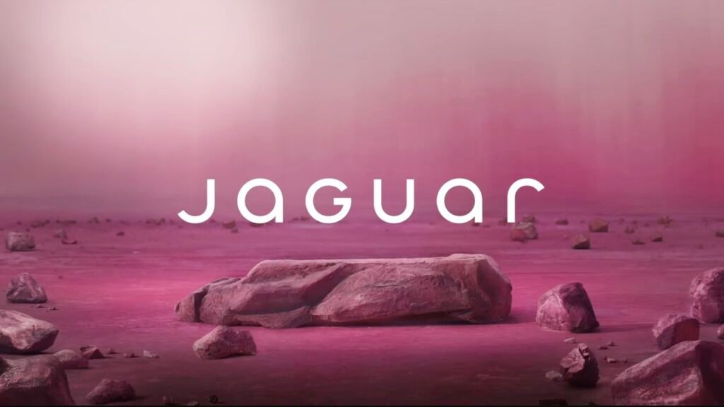
Jaguar unveiled a completely new logo and brand identity this week, ditching their iconic leaping cat symbol for a modern, minimalist design. The luxury car maker also announced they’re going fully electric by 2025.
The reaction was swift and brutal. Social media exploded with criticism, comparing the new look to everything from a generic tech startup to a luxury soap brand. Many longtime Jaguar fans called it the worst rebrand in automotive history.
The Risky Game of Rebranding
Jaguar joins a long list of major brands that have faced fierce backlash after dramatic makeovers. Remember when HBO Max became just “Max” and confused everyone? Or when Instagram tried to change its camera icon and users revolted so hard they partially reverted it?
The company is betting big that controversy will fade once people see their new electric vehicles. Jaguar’s design team says the old logo felt outdated and didn’t represent their electric future. They’re targeting younger, tech-savvy buyers who might not care about traditional car heritage.
But history shows mixed results for brands that stick with unpopular redesigns. Gap famously scrapped their new logo after just six days of complaints in 2010. Netflix, however, survived the backlash when they split their DVD and streaming services, though it took years to win back customer trust.
What Happens Next
Jaguar’s first electric model under the new brand launches in 2025. If the cars are hits, the logo controversy might be forgotten. If not, this rebrand could become a cautionary tale taught in business schools for decades.