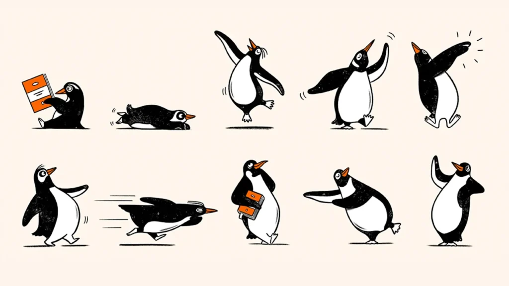
Penguin Random House just gave its famous penguin logo a major makeover. The publishing giant created a whole series of hand-drawn illustrations called “Playful Penguins” that show the iconic bird jumping, dancing, strutting, and reading books.
This is a big deal because the penguin has been stuck inside that orange oval since 1935. Now it’s finally free to move around and show personality across book covers, ads, and stores worldwide.
From Stiff to Silly
The idea started when Penguin Random House celebrated its 90th anniversary last year. The design team dug through old archives and found tons of expressive penguin drawings from decades past. When they used these playful birds in their anniversary campaign, readers loved them.
Derek Man, the company’s design director, realized people wanted to see more personality from the brand. The original penguin will still be the main logo, but now it has backup dancers.
The famous penguin logo has quite a story. Back in 1935, founder Allen Lane’s secretary suggested “Penguin” as a name that felt both dignified and playful. Lane then sent a 21-year-old artist named Edward Young to the London Zoo to sketch real penguins for inspiration.
These new Playful Penguins will appear everywhere as the company heads toward its 100th birthday in 2035. Instead of one serious bird trapped in an oval, readers will see penguins with personality bringing books to life.