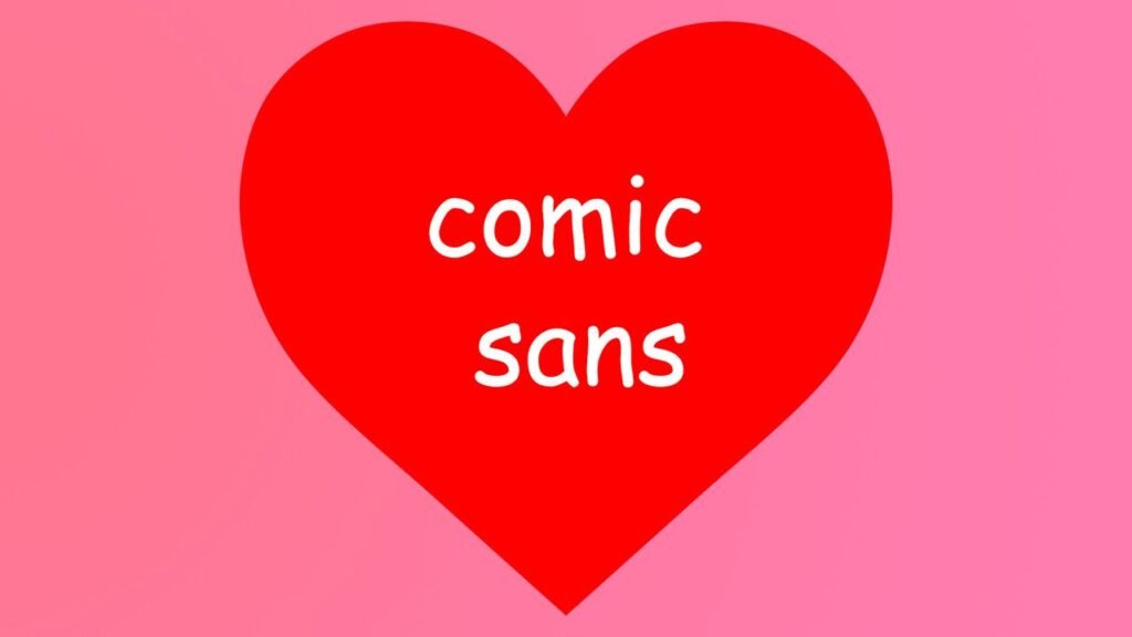
Comic Sans, the font everyone loves to hate, is getting a surprising comeback from professional designers who now say it’s actually perfect for certain uses.
For decades, Comic Sans has been the internet’s favorite font to mock. It’s been called unprofessional, childish, and overused. But designers are now arguing that all those “flaws” actually make it brilliant for specific situations.
The Font Everyone Got Wrong
Comic Sans was created in 1994 for Microsoft’s comic book software. The problem wasn’t the font itself – it was how people used it. Wedding invitations, business cards, and serious documents all got the Comic Sans treatment, which made designers cringe.
But here’s what those designers missed: Comic Sans is incredibly readable and friendly. Studies show it actually helps people with dyslexia read more easily because the letters are shaped differently from each other. Kids learning to read find it less intimidating than formal fonts.
The font also works perfectly for casual, approachable communication. Think food truck menus, kids’ birthday party invites, or friendly store signs. It signals “this isn’t scary or formal” in a way that Times New Roman never could.
What’s Next
Don’t expect Comic Sans to take over corporate America anytime soon. But designers are now teaching the “right” way to use it – for accessibility, children’s content, and anywhere you want people to feel comfortable. The font that became a joke might finally get the respect it deserves, just in the right places.